

Understanding Wall Cladding and Its Impact on Interior Design
What Is Wall Cladding?
In the realm of interior design, wall cladding has transcended mere functionality to become an expressive art form. It is fascinating to observe how the choice of wall cladding color can dramatically alter the ambiance of a space, turning a mundane room into a sanctuary of style. According to recent design trends, more homeowners are recognizing the power of color to evoke emotion and set the tone for their environment.
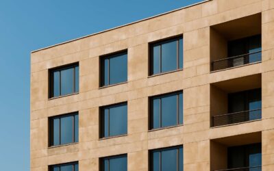
Wall cladding is essentially an outer layer applied to walls, crafted from an array of materials such as wood, stone, or composite panels. Its primary purpose is to enhance aesthetic appeal while providing durability and insulation. Yet, beyond these practical benefits, wall cladding profoundly impacts interior design by offering a palette of possibilities. The selection of wall cladding color influences perception; warmer hues create cozy, inviting atmospheres, while cooler shades evoke calm and sophistication.
When considering wall cladding and its impact on interior design, it’s important to understand how color harmonizes with other elements. For example, a bold wall cladding color can serve as a statement piece, anchoring the room’s visual narrative. Conversely, subtle shades can act as a versatile backdrop, allowing accent colors and furnishings to shine. The interplay of color, texture, and material ultimately shapes the personality of a space—an essential aspect for creating interiors that resonate on a deeper level.
Types of Wall Cladding Materials
Understanding wall cladding and its profound impact on interior design reveals a world where darkness and light dance in an intricate ballet. The choice of wall cladding color can transform a space from a simple refuge into a compelling tableau of emotion and atmosphere. In South Africa’s vibrant yet often shadowed interiors, the right hue can evoke serenity or stir a quiet, haunting energy.
Materials for wall cladding span from rugged stone to sleek composite panels, each offering a distinct canvas for color experimentation. Whether you prefer the deep, earthy tones of natural stone or the subtle elegance of painted wood, the wall cladding color becomes a vital element in shaping a room’s personality.
- Wood panels in dark hues can conjure a mysterious warmth,
- while metallic finishes in cool shades lend a sleek, contemporary allure.
Importance of Color in Wall Cladding
Wall cladding is no longer just about durability or texture; it’s a bold statement in interior design. In South Africa’s dynamic spaces, the wall cladding color can dramatically shift the mood—from tranquil retreats to energetic hubs. It’s fascinating how a simple hue can evoke serenity or stir a sense of mystery, transforming a room into a visual narrative that captures attention.
Choosing the right wall cladding color isn’t just about aesthetics; it’s about creating an atmosphere that resonates with your personality or brand essence. For instance, earthy tones in natural stone cladding can ground a space in warmth, while sleek metallic finishes in cool shades add a modern, sophisticated edge. The careful selection of wall cladding color works as a silent ambassador of style, subtly influencing how people feel within a space.
To master the art of color selection, consider the following:
- How the hue complements existing decor and lighting
- The emotional impact you wish to evoke
- The longevity of the color in relation to room usage
Factors to Consider When Choosing Wall Cladding Colors
Room Function and Mood
Choosing the right wall cladding color isn’t just about aesthetics; it’s a strategic decision that influences the entire ambiance of a space. For rooms like living areas or offices, the mood you want to evoke can be amplified or subdued by your choice of wall cladding color. Bright, vibrant hues energize and invigorate, making them ideal for social spaces, while muted, earthy tones foster relaxation and intimacy—perfect for bedrooms or retreats.
When considering room function, it’s crucial to think about how the wall cladding color interacts with natural light and other design elements. For instance, a small South African lounge bathed in sunlight can benefit from warmer tones that enhance the warmth, whereas cooler shades might provide a calming contrast in a workspace. Remember, the psychological impact of color plays a pivotal role in how a space feels and functions.
To ensure harmony, it helps to evaluate the overall style and personality of the space. Here are some factors to keep in mind:
- Room size and lighting conditions
- Intended use and atmosphere
- Existing decor and furniture tones
- Personal preferences and cultural influences
Lighting Conditions
In the grand theater of interior design, lighting conditions are often cast as the unsung hero—yet they wield more influence over your wall cladding color than one might assume. A vibrant, sunny South African lounge, basking in the golden glow of afternoon sun, can transform a simple wall cladding color into a jubilant statement of warmth. Conversely, a dimly lit study demands more subdued hues that won’t fade into the shadows, ensuring the wall cladding color complements rather than competes with the ambient light.
To navigate this subtle dance, consider the following factors:
- The direction your room faces—north-facing spaces tend to bask in consistent sunlight, making warmer tones more inviting, while south-facing rooms benefit from cooler shades that counterbalance the natural gloom.
- The intensity and quality of artificial lighting—warm LED lights can enhance earthy wall cladding color, whereas cooler bulbs might accentuate pastel shades.
Ultimately, the interplay between natural and artificial illumination crafts the perfect canvas for your wall cladding color, transforming mundane walls into curated expressions of personality and style.
Existing Interior Color Palette
Choosing the right wall cladding color requires more than just picking a shade that appeals visually. It’s vital to consider your existing interior color palette—these hues set the tone and influence the overall harmony of your space. When wall cladding color clashes with your current decor, it can create a discordant atmosphere that undermines your design intentions.
To achieve a seamless blend, assess the predominant colors in your room. If your interior features warm earth tones, selecting a wall cladding color with complementary hues can amplify the cozy ambiance. Conversely, cooler shades such as blues and greys work well with neutral or pastel interiors, creating a calming effect. Sometimes, a simple
- contrast
- complement
strategy can elevate the visual impact, ensuring your walls become a defining feature rather than a background afterthought.
Remember, the goal is to craft a cohesive aesthetic where wall cladding color enhances your space’s personality. When the existing palette harmonizes with your new wall cladding, the results are nothing short of transformative—an interior that feels both intentional and inspiring. Choosing the right wall cladding color is, after all, about weaving a story that resonates with your style, grounded in the vibrant South African context.
Texture and Material Finish
Choosing the right wall cladding color isn’t just about the shade; texture and material finish play a crucial role in your overall aesthetic. A glossy finish can reflect light, making a space feel brighter and more expansive, while matte textures lend a subtle sophistication. The tactile quality of your wall cladding color influences how the room feels—rough and rustic or sleek and modern.
When selecting textures, consider the room’s purpose. For example, a textured wall cladding color with natural stone or wood finishes adds warmth to living spaces. In contrast, smooth, polished surfaces work well in contemporary environments. Sometimes, combining different textures creates visual interest and depth, elevating your interior design.
Popular Wall Cladding Color Options and Their Effects
Neutral Tones for Versatility
In the quest to transform spaces with striking wall cladding color, neutral tones stand out as the silent heroes of versatility. They possess an almost magnetic ability to create a calming, sophisticated backdrop that complements any interior style. Whether you prefer the subtle elegance of soft beige or the understated charm of cool gray, these hues serve as a canvas for your creative expression. Neutral wall cladding color is also remarkably forgiving, allowing for easier updates with accessories, artwork, or seasonal accents.
For those seeking a balanced aesthetic, neutral tones act as an anchor, providing cohesion amidst diverse design elements. They invite a sense of order and tranquility—an essential quality in bustling South African homes and commercial spaces alike. When choosing wall cladding color, consider how these shades will interact with natural lighting and your existing decor. The right neutral can subtly redefine a room’s ambiance, making it feel more spacious, warm, or modern. Ultimately, neutral wall cladding color offers timeless appeal, making it a strategic choice for durability and style.
Bold and Vibrant Colors for Accent Walls
Bold and vibrant colors for wall cladding are a daring departure from traditional neutrals, transforming ordinary spaces into striking visual statements. Rich hues like deep emerald, fiery red, or electric blue infuse rooms with energy and personality, making them ideal for accent walls that demand attention. When expertly chosen, these colors can evoke emotion and set the tone for an entire room, adding depth and dimension through their intensity.
In South Africa’s diverse design landscape, the strategic use of bold wall cladding color can create a captivating focal point. Imagine a splash of crimson behind a sleek, modern sofa or a vivid turquoise in a lively kitchen—these choices breathe life into interiors. Such vibrant shades also serve to highlight architectural features or artwork, elevating the overall aesthetic and making a memorable impression.
For those seeking to harness the power of color, consider incorporating a curated palette of wall cladding options that complement your space’s natural light and existing decor. The right vivid hue can redefine a room’s ambiance, transforming it from mundane to mesmerizing. Bold wall cladding color is more than a trend; it is a statement of confidence and creative spirit that endures in the ever-evolving world of interior design.
Earthy Hues for Warmth and Comfort
Earthy hues for wall cladding color are an understated yet powerful way to infuse warmth and comfort into any South African interior. These shades—think terracotta, sandy beige, and warm taupe—evoke a sense of grounded serenity, reminiscent of the region’s rugged landscapes and golden savannahs. Such colors create an inviting ambiance that feels both timeless and sophisticated, making them a natural choice for spaces that aim to foster relaxation and connection.
In addition to their visual appeal, earthy hues have a remarkable ability to seamlessly blend with natural materials like wood and stone, enhancing the tactile experience of your wall cladding. For those seeking versatility, these colors serve as a neutral backdrop that complements vibrant accents or intricate textures, allowing your design to evolve effortlessly over time. When strategically used, earthy tones can elevate your interior, transforming it into an oasis of understated elegance amidst South Africa’s diverse aesthetic landscape.
Pastel Shades for Subtle Elegance
Among the myriad choices in wall cladding color, pastel shades evoke a subtle elegance that whispers rather than shouts. These delicate hues—think blush pinks, soft mint greens, or powder blues—imbue interiors with a tranquil, almost ethereal quality. In South African homes where sunlight dances differently across seasons, pastel wall cladding color creates an inviting sanctuary that balances warmth with serenity.
The gentle hues serve as a harmonious backdrop, allowing intricate textures and natural materials to shine through. For those seeking a nuanced palette, here’s a quick overview of popular pastel shades and their effects:
- Blush pinks add a touch of romantic softness, perfect for creating cozy, intimate spaces.
- Mint greens bring a fresh, invigorating vibe that complements lush indoor plants.
- Powder blues evoke calm and stability, ideal for bedrooms or tranquil living areas.
In juxtaposition with bolder accents, pastel wall cladding color enhances the overall aesthetic, offering a gentle visual respite. The magic lies in their ability to transform a room into a sanctuary—an understated yet captivating realm where subtlety reigns supreme.
Metallic Finishes for Modern Aesthetics
Metallic finishes on wall cladding color have become a defining hallmark of contemporary interiors, infusing spaces with a sleek, futuristic allure that commands attention. In South Africa’s vibrant design landscape, these reflective surfaces echo the dynamic interplay of sunlight and shadow, creating an ever-changing tableau that captivates the senses. The hypnotic shimmer of brushed aluminum or the luxurious luster of chrome transforms ordinary walls into statement pieces, elevating the aesthetic to a realm of modern sophistication.
For those seeking to harness the power of metallic hues, it’s essential to consider the interplay of light and texture. Metallic wall cladding color can serve as an accent or be woven into the fabric of a room’s palette, offering depth and dimension. To achieve a harmonious balance, many designers advocate for neutral tones as a backdrop, allowing the metallic sheen to shine without overwhelming the senses.
Furthermore, metallic wall cladding color lends itself beautifully to minimalist and industrial themes, where the reflective surfaces amplify the space’s sense of openness and clarity. Whether in an urban loft or a contemporary South African home, choosing the right metallic finish can turn a simple wall into a visual crescendo—an emblem of refined taste and cutting-edge design.
Tips for Coordinating Wall Cladding Colors with Interior Design
Balancing Colors with Furniture and Decor
When it comes to coordinating wall cladding color with interior design, harmony is the secret ingredient. A carefully chosen wall cladding color can elevate a space from mere aesthetics to a sanctuary of style. It’s about balancing shades with furniture and decor, ensuring that each element complements rather than competes. In South Africa, where vibrant hues and earthy tones blend seamlessly into daily life, understanding how to marry wall cladding color with your overall interior palette is crucial.
One effective approach involves considering the existing furniture and decor—furniture’s color, texture, and style serve as anchors for your wall cladding choices. For instance, pairing a neutral wall cladding color with bold, colorful furniture creates a striking yet balanced visual. Conversely, subtle pastel shades can soften the space, allowing intricate decor pieces to shine. To streamline this process, some designers prefer to follow these guidelines:
- Identify the dominant colors in your furniture and decor.
- Choose wall cladding color that either contrasts gently or complements these hues.
- Consider the mood you wish to evoke—warmth, serenity, or vibrancy—and select your shades accordingly.
Ultimately, the goal is to craft a visual story where every element, from wall cladding color to decor accents, works in unison to create a cohesive, inviting atmosphere. A well-coordinated palette not only enhances aesthetic appeal but also reflects the personality and spirit of the inhabitant, turning a house into a heartfelt home.
Creating Contrast or Harmony
Choosing the right wall cladding color can transform a space from ordinary to extraordinary, but the key lies in creating either striking contrast or harmonious unity. When aiming for contrast, consider pairing bold wall cladding colors with subdued furnishings to make each element pop without overwhelming the senses. Conversely, opting for a harmonious palette involves selecting wall cladding colors that echo existing decor, fostering a sense of flow and calm throughout the room.
To master this delicate balance, it helps to visualize the overall atmosphere you want to craft. For example, a deep charcoal wall cladding color can anchor a room with a touch of sophistication, while a soft beige or earthy tone can evoke warmth and comfort. Remember, the interplay of color, texture, and lighting in South Africa’s vibrant environment can dramatically influence how wall cladding colors appear in different settings.
- Assess your space’s natural light to determine whether warm or cool tones will thrive.
- Reflect on the mood—whether lively or tranquil—that you wish to evoke with your interior design.
- Experiment with contrasting shades or harmonious hues to see what best complements your furniture and decor.
Ultimately, the art of coordinating wall cladding color hinges on understanding the subtle dance between contrast and harmony, turning your interior into a true reflection of personality and style.
Using Color Psychology to Influence Mood
Color psychology offers a compelling lens through which to view your wall cladding color choices. In South Africa’s diverse environment, understanding how different hues influence mood can elevate your interior design from mere aesthetics to a powerful emotional experience. Warm tones like terracotta or burnt orange evoke feelings of warmth and vitality, perfect for communal spaces. Conversely, cool shades such as blues or muted greens foster tranquility and relaxation, ideal for bedrooms or retreats.
When selecting wall cladding color, consider the emotional resonance you wish to create. A vibrant red or striking yellow can energize a room, while softer pastel shades lend subtle elegance. To deepen the impact, balance these hues with carefully chosen furniture and decor—either contrasting for a lively effect or harmonious to maintain serenity. Remember, the interplay of color, texture, and lighting in South Africa’s unique climate can dramatically alter how your wall cladding color appears throughout the day, making thoughtful selection all the more crucial.
- Assess the natural light to see how different wall cladding colors will react in your space.
- Reflect on the desired emotional tone—whether lively or tranquil—that aligns with your personality and lifestyle.
- Experiment with contrasting shades or harmonious hues to discover the perfect balance for your interior aesthetic.
Layering Colors and Textures for Depth
Choosing the perfect wall cladding color is only half the battle—layering your interior design with complementary colors and textures transforms your space from boring to breathtaking. Think of it as a culinary masterclass: the right blend of ingredients creates a dish that delights the senses. When coordinating wall cladding color with your decor, consider adding depth through contrasting or harmonious textures. For instance, pairing a matte wall cladding color with glossy finishes on furniture or accessories can produce an eye-catching interplay that keeps the eye moving and the mind intrigued.
To ensure your design doesn’t end up looking like a chaotic painter’s palette, a strategic approach is essential. Here are some tips:
- Start with a neutral base—this provides a versatile backdrop for experimenting with bold or pastel hues.
- Introduce textured elements—think woven rugs, textured cushions, or stone accents—that complement your wall cladding color without overpowering it.
- Balance vibrant wall cladding color with subdued tones elsewhere to avoid visual fatigue. Remember, sometimes less is more!
By thoughtfully layering colors and textures, your interior will radiate cohesion and personality—making your South African home a true sanctuary of style and comfort. Because, after all, your wall cladding color deserves to shine in a well-curated, multi-dimensional universe of design!
Advantages of Selecting the Right Wall Cladding Color
Enhancing Property Value
Choosing the right wall cladding color can dramatically elevate your property’s value, transforming a mundane space into an alluring haven. When expertly selected, wall cladding color acts as a visual anchor, attracting potential buyers and elevating curb appeal. A well-balanced hue can communicate a sense of sophistication and harmony, making your property stand out in South Africa’s competitive real estate market.
In fact, properties with thoughtfully chosen wall cladding color often enjoy quicker sales and higher offers. This is because color influences perception — it can evoke feelings of warmth, stability, or modernity. A strategic choice of wall cladding color not only enhances aesthetic appeal but also creates an emotional connection with viewers.
The secret lies in understanding how the right hue complements architectural style and surrounding environment. Whether you’re leaning towards earthy tones for a natural vibe or bold shades for a contemporary edge, the wall cladding color can be the difference-maker that amplifies your property’s overall value.
Expressing Personal Style
Choosing the perfect wall cladding color is akin to painting a canvas where every hue whispers its story. When you select colors that resonate with your personal style, your space transforms from mere construction to a living expression of identity. It’s not just about aesthetics; it’s about crafting an atmosphere that feels uniquely yours—bold, subtle, or somewhere beautifully in between.
Imagine the power of a carefully curated wall cladding color to evoke emotion—serenity, excitement, or sophistication. This is where the magic of color psychology intertwines with your vision, elevating your property’s character and allure. Whether you favor the calming embrace of pastel shades, the earthy richness of natural tones, or daring accents that command attention, each choice acts as an extension of your personality.
In South Africa’s vibrant landscape, a strategic selection of wall cladding color can carve out a distinctive niche—making your property not only stand out but also resonate deeply with viewers. The right hue becomes a visual melody, harmonizing with architectural style and environment, ensuring your home becomes an unforgettable statement. After all, beauty lies in the deliberate choice of colors that reflect your essence—an artful dance of contrast and cohesion that leaves a lasting impression.
Achieving Visual Cohesion
Choosing the right wall cladding color isn’t just a matter of aesthetics; it’s a strategic move to achieve visual cohesion that elevates your property’s overall appeal. When colors complement each other seamlessly, your space feels more inviting and thoughtfully curated. This harmony can make even the most modest property appear sophisticated and well-designed, which is crucial in South Africa’s competitive real estate market.
Moreover, a well-chosen wall cladding color can subtly influence how viewers perceive your space. It creates a unified backdrop that enhances architectural features and highlights key design elements. To maximize this effect, consider the color palette’s relationship with existing structures and surroundings. Achieving this balance often results in a property that resonates deeply with viewers, making it memorable long after the initial impression.
- Enhanced aesthetic appeal
- Increased property value
- Improved architectural harmony
- Personalized environment that reflects your style
By carefully selecting your wall cladding color, you can craft a cohesive visual language that not only beautifies your property but also communicates personality and intent. In a landscape as vibrant and diverse as South Africa’s, this deliberate choice becomes a powerful tool to stand out—without shouting. It’s about creating a balanced narrative through color that invites admiration and connection.
Maintaining Timeless Appeal
Choosing the right wall cladding color can transform your property into a timeless masterpiece. When you select hues that resonate with your environment and personal style, you create an enduring aesthetic that withstands the test of time. This strategic choice not only elevates your home’s visual appeal but also ensures its charm remains relevant through changing trends.
A well-curated wall cladding color embodies sophistication and subtlety, turning your property into a statement of elegance. It’s about embracing hues that complement your surroundings while subtly influencing perceptions of space and harmony. For example, earthy tones foster warmth and stability, while neutral shades offer versatility that never goes out of style.
In the realm of wall cladding, maintaining a timeless appeal hinges on understanding how colors age gracefully. When combined thoughtfully, the right wall cladding color can evoke emotion, highlight architectural features, and foster a sense of continuity that endures for generations.
Maintenance and Longevity of Wall Cladding Colors
Choosing Durable Colors and Finishes
Choosing the right wall cladding color isn’t merely about aesthetic appeal; it’s an investment in the longevity and ease of maintenance of your space. Durable colors and finishes can significantly extend the lifespan of wall cladding, resisting the wear and tear inflicted by South Africa’s vibrant climate. After all, a well-chosen wall cladding color coupled with robust finishes acts as a shield against fading, chalking, and other forms of degradation that can turn a stunning façade into an eyesore over time.
To ensure your wall cladding maintains its pristine condition, opting for high-quality, weather-resistant paints and finishes is paramount. These finishes often feature anti-fade properties, UV resistance, and even mold inhibitors. For those who appreciate simplicity, here’s a quick overview of what to look for:
- UV-resistant coatings that guard against sun damage
- Moisture-proof finishes to prevent water infiltration
- Scratch and impact-resistant layers for high-traffic areas
When selecting your wall cladding color, think beyond mere visuals. The durability of the color and finish plays an equally pivotal role in maintaining the visual harmony and structural integrity of your project. A strategic choice here not only elevates the property’s curb appeal but also reduces costly refurbishments down the line—truly a win-win scenario!
Cleaning and Upkeep Tips
The true test of a stunning wall cladding color lies in its ability to withstand the relentless South African climate. Regular cleaning and maintenance play a crucial role in extending the lifespan of your wall cladding color, ensuring it remains vibrant and appealing for years to come. Dirt, grime, and pollution can dull the finish, but with a consistent upkeep routine, you can preserve its original charm.
To keep your wall cladding looking fresh, use gentle cleaning agents and avoid harsh abrasives that may scratch or damage the surface. For stubborn stains, a soft cloth or sponge combined with mild soap works wonders. The key is to act promptly before grime sets in, preventing long-term discoloration. Incorporating a regular maintenance schedule not only sustains the aesthetic appeal but also fortifies the durability of your wall cladding color against the elements.
- Schedule routine inspections to check for signs of fading or damage.
- Touch up chipped or scratched areas with matching paint to prevent further deterioration.
- Apply protective sealants periodically to enhance resistance against moisture and UV rays, especially important in South Africa’s diverse climate.
Investing in high-quality, weather-resistant paints and finishes is the secret to maintaining a pristine appearance. These coatings are formulated to resist chalking, fading, and impact—crucial factors for preserving your wall cladding color. With proper care, your facade can retain its allure, making a lasting impression that endures through the seasons and the years.
Preventing Fading and Discoloration
In the dance of sunlight and shadow that graces South African facades, the true longevity of your wall cladding color is a testament to vigilant care. Fading and discoloration threaten to erode the vivid tapestry you’ve chosen, but with mindful maintenance, your walls can defy time’s relentless march. Regular inspections reveal subtle signs of wear—faded patches or minor chips—that, if addressed promptly, preserve the integrity of your chosen hue.
Applying protective sealants periodically acts as an invisible shield, bolstering resistance against UV rays and moisture—two formidable foes in our diverse climate. To sustain the vibrancy, gentle cleaning using mild soap and soft cloths is essential, avoiding abrasive cleaners that may dull or scratch the surface. For stubborn stains, a careful touch-up with matching paint can rejuvenate the wall cladding color, ensuring your property remains a beacon of aesthetic allure.
- Routine inspections help identify early signs of fading or damage.
- Touch-ups with matching paint prevent further deterioration.
- Applying weather-resistant finishes enhances durability and color retention.
High-quality, weather-resistant paints are the unsung heroes in this pursuit. Their advanced formulations resist chalking, fading, and impact—preserving your wall cladding color with unwavering resilience. With consistent upkeep, your facade can continue to tell a story of elegance and endurance, radiating charm through every season and beyond, a true testament to the enduring power of well-maintained wall cladding color.
Conclusion
Choosing the perfect wall cladding color is akin to selecting a wardrobe for your home—an expression of personality, taste, and an understanding of the space’s soul. In South Africa’s vibrant landscape, where hues dance from desert sands to lush greens, the wall cladding color must resonate with local aesthetics and climate nuances. It’s not merely about style; it’s about creating an ambiance that endures.
As we’ve explored, the impact of wall cladding color extends beyond mere aesthetics—it’s a subtle conversation between your space and its inhabitants. Whether you prefer a bold statement or a subdued elegance, the right hue can elevate your interiors and exteriors alike. For those seeking harmony, a balanced palette ensures your property complements its surroundings while standing out just enough to turn heads without causing a scene.
Ultimately, the choice of wall cladding color is a dialogue—one that involves your personality, the environment, and the message you wish to convey. Here are some considerations to keep in mind:
- Climate compatibility
- Architectural style
- Personal taste and mood
In South Africa’s diverse climate and cultural tapestry, selecting the ideal wall cladding color is an art—an understated yet impactful detail that binds the whole design narrative together. After all, a well-chosen hue doesn’t just beautify; it narrates your story. And isn’t that what truly makes a space unforgettable?

0 Comments